How to Choose the Right Paint Color for Every Room (2026 Trends)
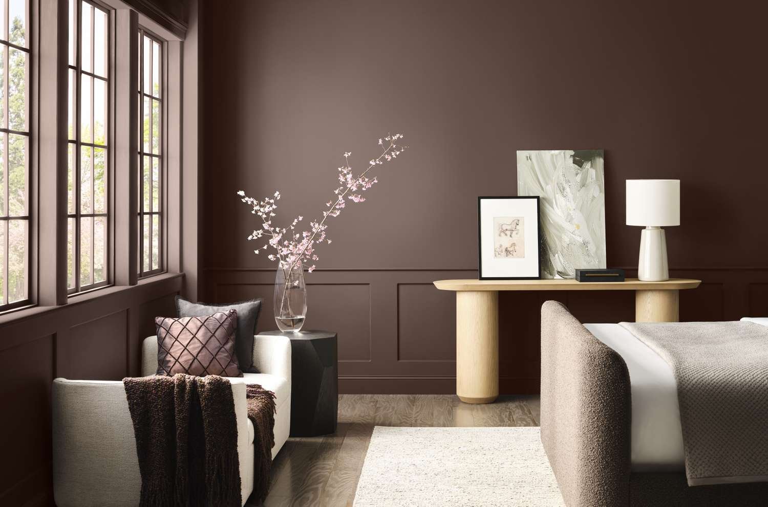
Picking a paint color sounds simple until you’re standing in front of forty shade cards, all looking suspiciously similar. I’ve helped enough friends through this exact moment of paralysis to know it needs a proper system, not just gut instinct. Let’s talk paint color trends for 2026 and how to actually choose confidently.
Understanding Undertones Before Anything Else
Quick answer: Every paint color has an undertone — warm (yellow, red, orange base) or cool (blue, green, purple base) — and identifying this before choosing prevents colors that look completely different once on your wall compared to the small sample card.
This is the single biggest reason people get frustrated with paint choices. A “white” with a yellow undertone looks completely different from a “white” with a grey undertone once it’s covering an entire wall.
2026 Paint Color Trends Worth Considering
- Warm terracotta and clay tones — bringing earthy warmth, especially popular for living rooms and dining spaces
- Sage and muted greens — calming, versatile, works well in bedrooms and home offices
- Deep, moody blues — for accent walls or smaller spaces wanting a dramatic touch
- Warm off-whites over stark whites — softer, less clinical feeling than the cool whites popular a few years back
- Earthy neutrals with texture — limewash and textured finishes gaining popularity over flat paint
Choosing Colors Room by Room
Living Room
Living rooms benefit from warm, welcoming tones since this is where people gather. Terracotta, warm beige, or sage green work well. Avoid overly bright or cool colors that can feel unwelcoming for a social space.
Bedroom
Quick answer: For bedrooms, muted and cooler tones like soft blues, sage greens, or warm greys promote relaxation better than bright or highly saturated colors, which can feel stimulating rather than calming.
Kitchen
Lighter, energizing tones work best — soft yellows, warm whites, or light sage. Kitchens benefit from colors that feel clean and bright given the amount of activity that happens there.
Bathroom
Cooler blues and greens evoke a spa-like, clean feeling. Avoid very dark colors in small bathrooms without good ventilation, as they can make the space feel smaller and closed in.
Home Office
Muted blues or greens support focus without being distracting. Avoid overly bright or busy colors that compete for attention during work hours.
The 60-30-10 Rule for Color Balance
This classic design rule still holds up well:
- 60% dominant color (usually walls)
- 30% secondary color (furniture, larger accents)
- 10% accent color (decor, cushions, small details)
Following this ratio prevents a room from feeling either boring (too monotone) or chaotic (too many competing colors).
Testing Paint Colors Properly Before Committing
- Always test a sample patch directly on your wall, not just on paper
- View the sample at different times of day — morning light and evening light change how colors appear dramatically
- Live with the sample for at least 2-3 days before finalizing
- Test in the actual room it’s meant for — lighting varies significantly between rooms
Small Space Color Strategies
Quick answer: For small rooms, lighter colors with cool undertones create an illusion of more space, while keeping trim and ceiling the same color as walls (rather than stark white) removes visual breaks that make a room feel choppy and smaller.
Common Paint Color Mistakes to Avoid
- Choosing color based on a tiny swatch without testing on the actual wall
- Ignoring how artificial lighting at night changes color appearance
- Matching every room to a single color scheme without considering each room’s function
- Going too trendy on large wall surfaces — trends change, walls are expensive to repaint
[link to related guide on interior painting costs here]
Frequently Asked Questions
How do I know if a paint color has a warm or cool undertone? Compare it against a true white or grey reference — if it looks yellow/orange-ish by comparison, it’s warm; if it looks blue/grey-ish, it’s cool.
Should ceiling color always be white? Not necessarily. A slightly tinted ceiling (matching or complementary to wall color) can make a room feel more cohesive, especially in rooms with lower ceiling height.
How many paint samples should I test before deciding? Testing 2-3 close options directly on the wall is usually sufficient to see real differences under your specific lighting conditions.
Do darker colors make a room feel smaller? Not always — dark colors in a well-lit room with good natural light can feel cozy and intentional rather than cramped, especially with contrasting trim.
How often do interior paint color trends actually matter for a home? Trends are useful for inspiration, but choose colors you’ll genuinely enjoy long-term, since repainting every time trends shift isn’t practical or necessary.
Conclusion
Choosing the right paint color comes down to understanding undertones, testing properly on your actual walls, and matching color psychology to each room’s purpose. The 2026 trends lean warmer and earthier compared to previous years, but honestly, the best color for your home is the one that fits how you actually live in each space. Take the testing step seriously — it’s the one part of this process people skip most often, and it’s the one that prevents the most regret.